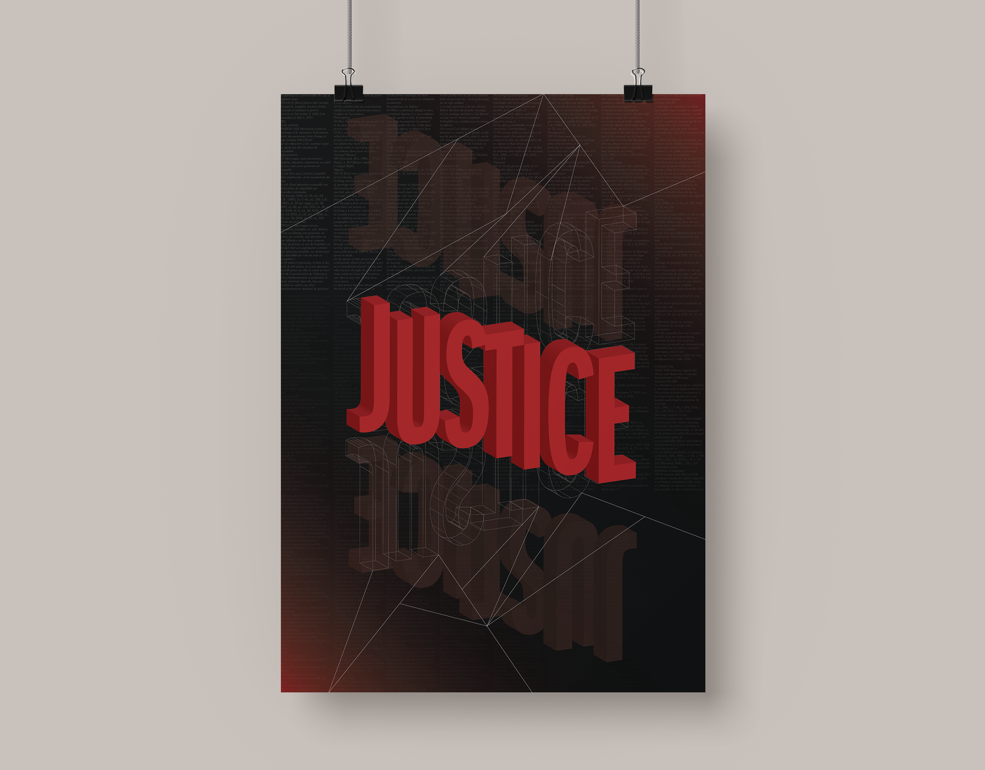
'In Defense of the Poor Image' is an article written by Hito Steyerl in 2009. Admittedly, I found this article fairly difficult to comprehend and I had to read it several times over before I properly understood it (it's a solid read if you have a moment). This was for a type class of mine, and we were tasked to present the article in several different ways – there were no boundaries as to what form it could take, but it had to make sense in context of what the article was about. My most successful form was this large-scale 24x36 inch poster where I contrasted massive type against tiny body text (which is the entire article fitting on one poster, by the way). The reason I chose this direction is because you would never see such a huge body of text presented this way on a poster that was intended to be read, meaning I accomplished what Hito Steyerl spoke of when it comes to the way images and content are distorted today. This poster is one of my most refined typographic designs yet as I had to go through multiple rounds of small changes to perfect the type (from paragraph structure to line height to text weight, the list goes on).
(If GIF is not playing, click on it!)
To the left is an example of another form I experimented with for the assignment to showcase how unconventional our ideas could get. I believe I had to compose and post around 350-375 tweets to get the entire article up on Twitter (yes, it was as tedious as you think). I then compiled screenshots of the tweets into a GIF to emphasize the idea of distortion and how the meaning of the article changes when put in a different context. The speed at which the images are changing was also a slight representation of how it felt to read this article over and over again. This project taught me that thinking outside of the box and taking unusual approaches can work out beautifully if done properly.


