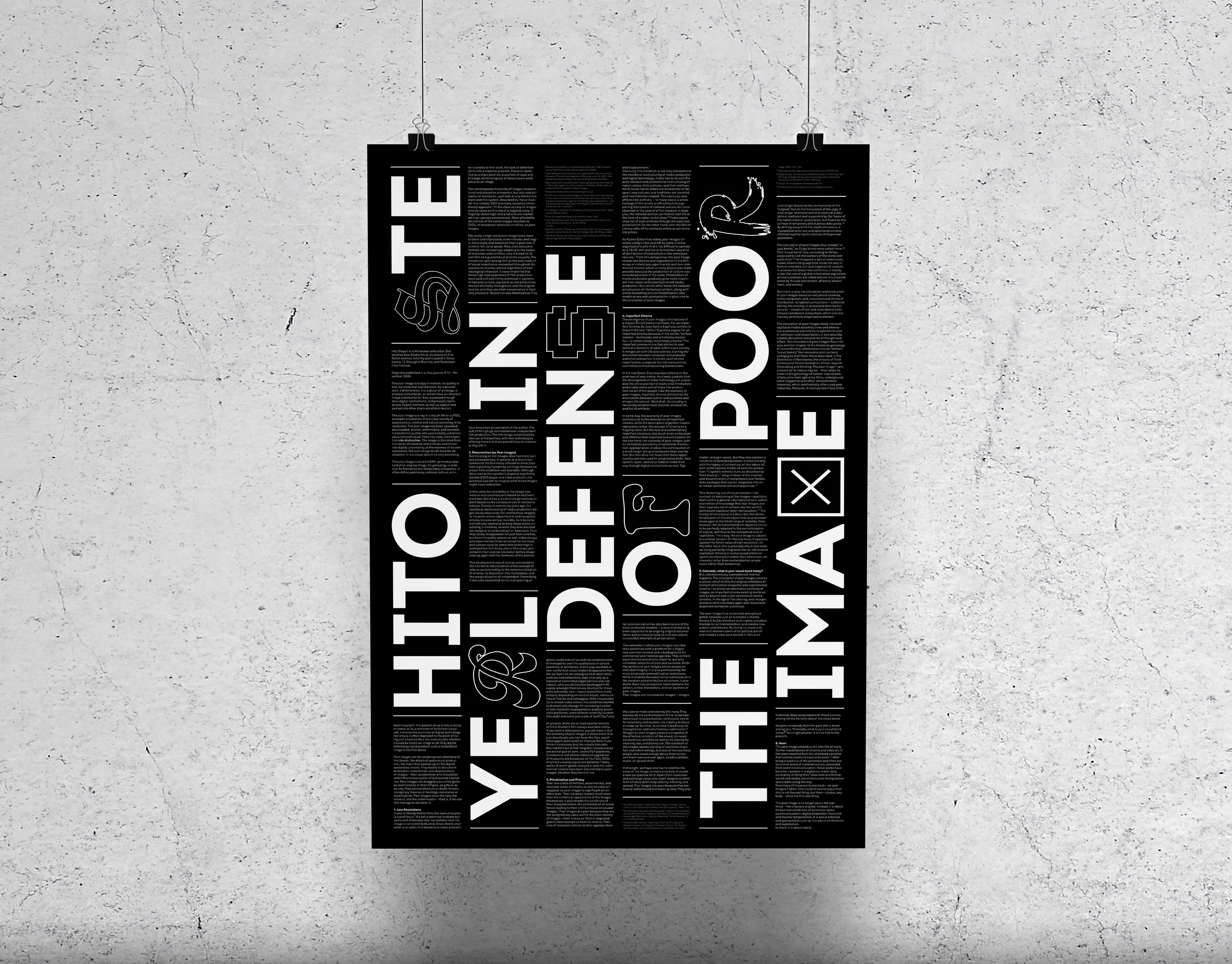
Editorial design is a long-time favourite of mine, so I created ‘Kritique Magazine’ for a typography class. The content of the zine includes typography-related articles accompanied by my critical responses from a designer's perspective. The continuous line illustrations that run throughout the spreads tie the whole piece together as well as the white text on black. While this is a more unconventional approach to a publication, I have always found the aesthetic of black pages something special and very unique. I ensured the text is legible and kept the columns of text undisturbed for an easy reading experience.
